平安集团校招官网动画过渡效果

前言

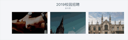
最近公司接了一个平安集团校招官网的项目,毕竟人家平安集团是个大企业嘛,那这个项目就必须得高端大气上档次呀,因此我就按照设计师的要求在许多地方加入了动画的过渡效果,也有一两周没更新博客了,那正好看看关于css的这简单酷炫的动画效果吧

The first part

效果:

image

css关键代码:
1
2
3
4
5
6
7
8
9
10
11
12
13
14
15
16
17
18
19
20
21
22
23
24
25
26
.c_content {
opacity: 0;
background: rgba(0, 0, 0, 0.5);
transition: all 0.4s ease;
&:hover {
opacity: 1;
h3 {
-webkit-transform: translateY(0);
opacity: 1;
}
.c_about {
-webkit-transform: translateY(0);
opacity: 0.8;
}
}
h3 {
-webkit-transform: translateY(40px);
transition: all 0.4s ease;
opacity: 0;
}
.c_about {
opacity: 0;
-webkit-transform: translateY(40px);
transition: all 0.4s ease 0.1s;
}
}
代码解析:

可能gif图太快了,效果看的不太清,非常的简单,我们只要考虑两个地方:

  1. 背景:先设置半透明黑色背景的透明度opacity:0,并且加入过渡属性transition,然后在:hover 选择器的时候将透明度opacity:1,即可。
  2. 文字:透明度和背景一样,先设置opacity:0,在:hover选择器执行的时候设置opacity:1。 接着设置他们的位置,在默认情况下位置是transform: translateY(40px);Y轴负方向偏移40px 在:hover选择器执行的时候设置transform: translateY(0);偏移量为0 即可
更厉害点的效果:

image

The second part

效果:

image

css关键代码:
1
2
3
4
5
6
7
8
9
10
11
12
13
14
15
16
17
18
19
20
21
22
23
24
25
26
27
28
29
30
31
32
33
34
35
li {
transform: translateY(350px);
opacity: 0;
}
.actived {
transform: translateY(0) !important;
opacity: 1;
}
li:first-of-type {
-webkit-transition: all 0.8s ease;
-o-transition: all 0.8s ease;
-moz-transition: all 0.8s ease;
transition: all 0.8s ease;
}

li:nth-of-type(2) {
-webkit-transition: all 1.3s ease;
-o-transition: all 1.3s ease;
-moz-transition: all 1.3s ease;
transition: all 1.3s ease;
}

li:nth-of-type(3) {
-webkit-transition: all 1.8s ease;
-o-transition: all 1.8s ease;
-moz-transition: all 1.8s ease;
transition: all 1.8s ease;
}

li:nth-of-type(4) {
-webkit-transition: all 2.3s ease;
-o-transition: all 2.3s ease;
-moz-transition: all 2.3s ease;
transition: all 2.3s ease;
}
代码解析:

这四个卡片最外层是四个< li >标签,我先判断页面的滚动距离,如果滚动距离达到了四个卡片的位置的话,卡片就添加 actived 属性。这里很好理解,就是当滚动距离达到了相应位置,将位置从下边350px 的地方变成0px 而已,关键在于first-of-type与nth-of-type(n) 属性,规定属于其父元素的第n个子元素的每个子元素 。所以我们把每个< li >标签设置不同的过渡时间即可。

还有一种效果

image

The third part

效果:

image

css关键代码:
1
2
3
4
5
6
7
8
9
10
11
12
13
14
15
16
17
18
19
20
21
22
23
24
25
26
.title {
transform: translateY(350px);
opacity: 0;
transition: all 1s ease;
}

.title {
transform: translateY(0) !important;
transition: all 1.2s ease;
opacity: 1;
}

#menu li {
width: 30px;
transition: all 0.6s ease;
}
#menu a {
transition: all 0.6s ease;
opacity: 0;
}
#menu .active a {
opacity: 1;
}
#menu .active {
width: 53px;
}
代码解析:

这里用了一个Fullpage.js的JQuery插件,全屏翻页效果。动画效果分为文字部分和导航条部分

  1. 文字部分:翻页的时候会添加 actived属性,那么在文字默认效果是 位置在下方350px;透明度为 0;过渡时间 1s; actived属性的效果是 位置为0px;透明度为 1;即可做到文字上浮效果
  2. 导航栏部分:默认的时候长度为30px;文字透明度为 0;actived属性的时候 长度为53px;透明度为 1,即可